I was invited by Troy DeShano to take part in his collaborative design project, Futuralbum. The concept was simple: Create an alternative album cover using only Futura (in any weight) and images from the Flickr Internet Archive Book Images.
There’s this really great vintage vibe that permeates throughout the entire library, but I thought it would be a fun challenge to work within the constraints, while adding in an anachronistic aesthetic. Something about blending in this hand-drawn antique feel with an amped up science fiction 80s seemed like a perfect flex for that environment.
More importantly, I’ve always loved how the 80s treated science fiction. The films were bold, loud, and downright silly at times. But there’s something infectious about its hyperbolic dreams of the future; they’re not bound by the hyper-realism that we subject modern films to. There’s no microscope fact-checking each and every claim. This girl’s got rocket launchers for arms? Awesome. This guy’s actually an android being piloted by a cybernetic praying mantis? I’m all in.
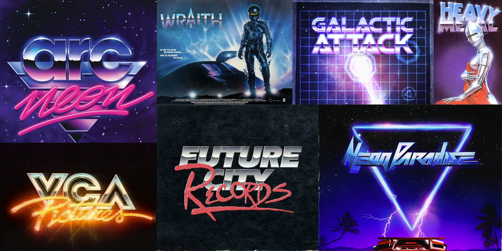
I assembled some of my favorite inspiration pieces that are either from or inspired by this wondrous little slice of time. James White’s Uzicopter tumblr is one hell of a moodboard if you’re interested.
Building the cover was so much fun, but undoubtedly the most critical part was getting the type right. I obviously didn’t have to make a choice for the typeface (Thanks, Troy!), but getting effects down pat had more than its fair share of struggles. Below you’ll find a small visual documentation of how I created some of the more dynamic elements of the type—which I strived to keep reminiscent of some of the more flashy, over-the-top treatments of old.
Ultimately, in my process, there was no real short cut to creating it. As everyone’s different, there very well may be a more direct, compact approach to these renderings, but I really enjoy getting to “paint” things on myself; it gives you can incredible amount of control over the piece. The original type was created in illustrated and imported into Photoshop by dimensional faces. From there, colors are masked onto the individual faces as I use brushes to add colors and gradients. It’s laborious but it’s also one of the more fun techniques to play in. The results you get can be incredibly varied by adjusting a single color or blending mode.
Gradually changing temperatures in a piece make for some dynamic transitions. Try using warm colors (say orange) and transitioning into some of the cooler ends of the spectrum (like a royal blue or purple). These add complex visual patterns that stand out—especially when you’re working with a more muted background palette.
In order to get a real handle on just how to create these pieces, it was necessary to do some experimentation. Before actually creating the full Dynatron type, I played around with some additional covers (that I did for the album’s singles) to get a few running starts.
When you have the time, I find that these purely exploratory iterations can yield some helpful results; showing you what works and what absolutely doesn’t. For these creations, I didn’t stick to the Futuralbum guidelines in having to use images from the Flickr Internet Archive Book Images. Instead, I created my own visuals that would aid the experience without any constraints attached. Without any restrictions, you’re able to create unfettered creation that purely pulls from whatever is in your own mind. I find that this is a particularly useful technique when working on client projects: Do a first round where you just go nuts with the piece before having to reel it back in to Earth.
Overall, I’m happy with how it all turned out and would love to give this aesthetic a go again at some point. But more importantly, go check out the entire Futuralbum project. It’s a real treat for the eyes! Also, feel free to give Dynatron a listen here.


