PayPal
In 2011, I was approached by PayPal to create an illustrative visual language with an internal team to unify and more clearly communicate the offerings of the company. Over the next few months, we worked hard to not just develop a style, but a system of illustrations that could be used in the various mediums by which PayPal interacts with consumers.
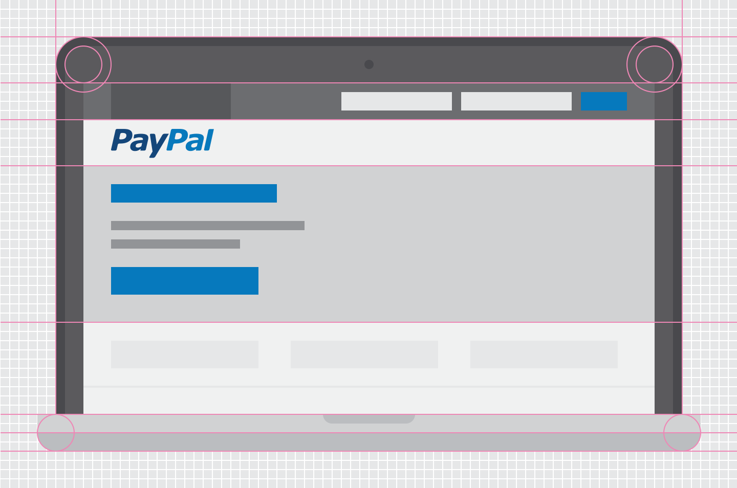
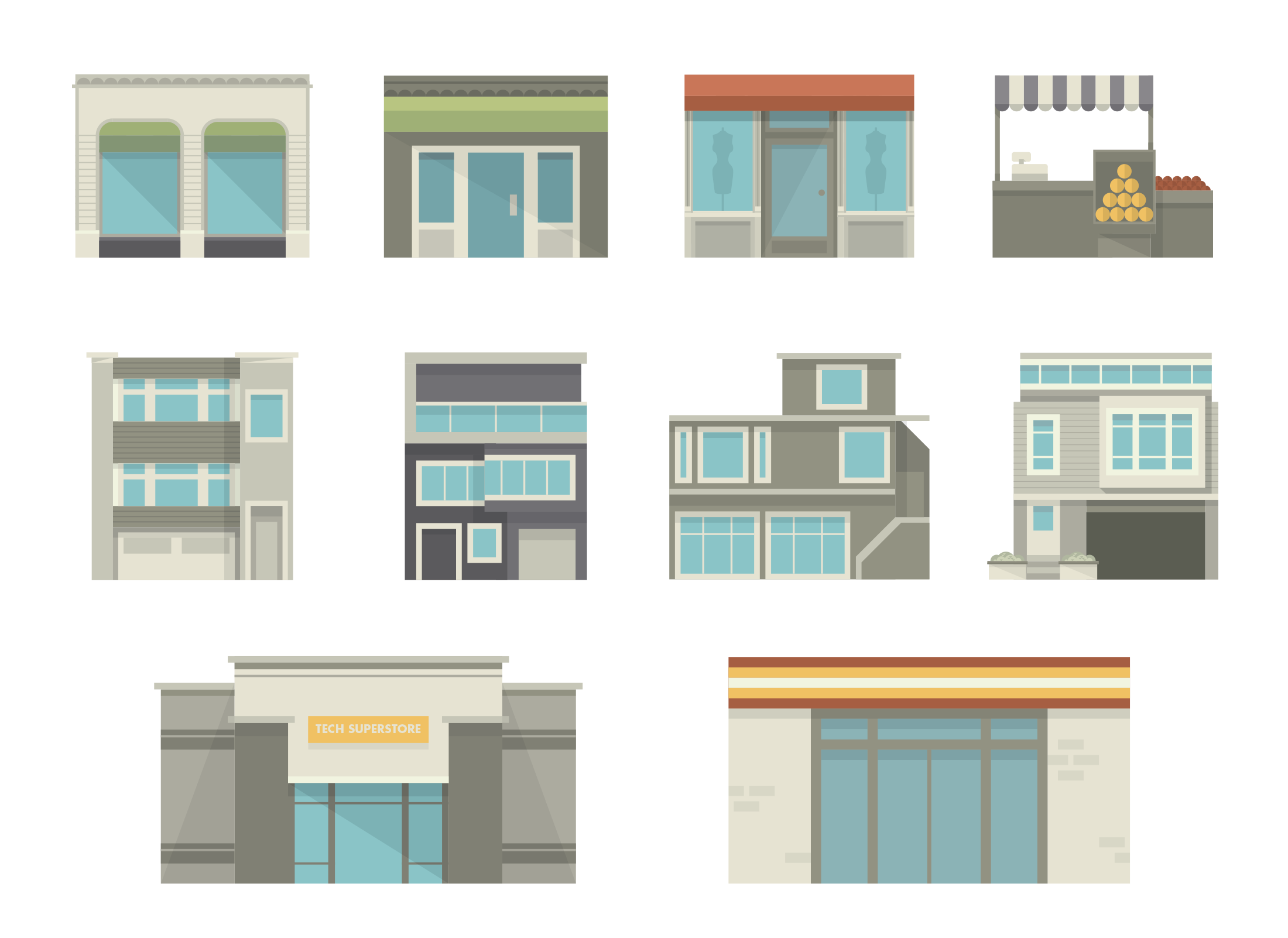
Using a consistent grid system and limited color palette, I built a number of illustrations that would serve to populate PayPal's visual world. The challenge was to come up with a solution that was flexible enough to be effective in organic, as well as technical illustrations and be able to break down complex objects into simple geometry (45º angles and ellipses with intentional exceptions). Since that time, we've continued building out a plethora of elements, working to fine tune and improve upon the initial concept in this sprawling visual world.
Below are a few selections that can be seen at PayPal.


